Branding the Tortoise
We're writers. We're not used to the whole "branding" thing. But we are trying to create a brand here, so it's something we gotta work on, slow and steady.
We're hoping to have a table at the Printers Row Lit Fest, to sell books and connect with new authors and what-not. (We put in our application this week, a couple days ahead of their deadline. We emailed it AND, because tortoises are cautious, we sent a redundant copy via FedEx Overnight with the Next Business Morning delivery option. It felt very un-Tortoise.) ANYWAY, since we'll be selling books, we want a brand for those books, and since we want a brand, we figured we'd better get a logo.
We first needed something as a placeholder for our Twitter account, because we didn't want just the standard blank photo icon, although since Twitter uses an egg, it's oddly apropos. (No one knows which comes first between the chicken or the egg, but when it comes down to the tortoise and the egg, it's clearly the latter, at least as far as they're concerned.) ANYWAY, we combed the interwebs and didn't like most of the pictures, but this proved a worthy logo for the first week:
We wanted something a little more...lively, though.
We mentioned this to our journalist friend Amy Hayden, recently of TimeOut Chicago, while hanging out at Chicago Zine Fest with our friends Elizabeth Tieri and Rob Chambers from Back To Print and The Deadline. (We're involved with those publications as well, so we were helping man the table, while also passing out postcards with a picture of a dead Nazi on them to promote our first book, Resistance. On a side note, just as an FYI, pictures of dead Nazis kinda creep people out, and when your head's shaved, it adds to the general level of creepiness.) ANYWAY, my friend's son--the talented and personable Basil--promptly offered to design a logo for us. Here's what he came up with:
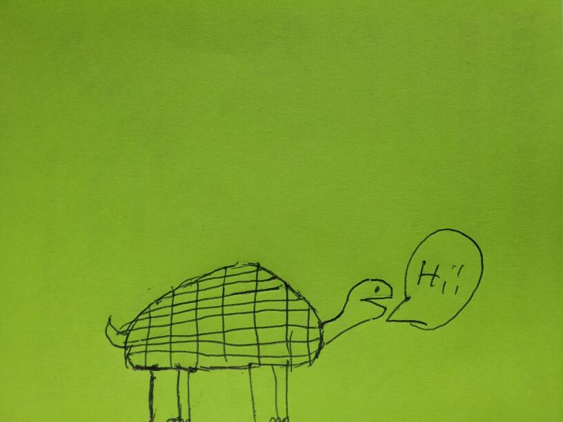
His picture, while not without a certain charm, isn't quite the image we're hoping to project, although we are keeping it on file in the even we start a kids label.
Fortunately, we were also able to enlist the even-more-considerable talents of our good friend Rachele O'Hare, who drew a design that somehow combined the black-and-white seriousness of Tortoise #1 with the whimsy of Tortoise #2. While it still needs a couple slight tweaks, we were excited enough that we showed it off to a good many friends, and we got so excited we had to listen to mellow indie rock and mellow Euro-techno (Lambchop's OH (ohio) and The Notwist's Neon Golden, respectively) to slow us down to our normal tortoise pace. And we still had a hard time sleeping!
Anyway, without further ado, here's what she came up with:
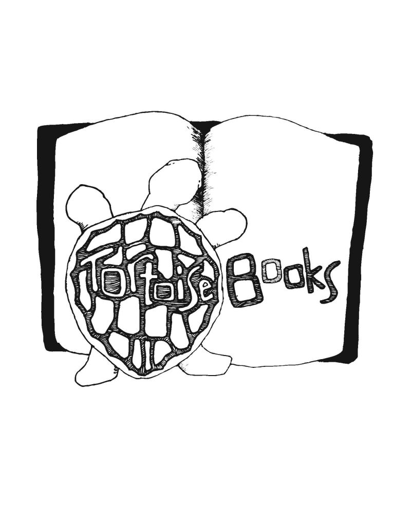
Not bad!